


New South Wales doesn’t typically publish the patronage statistics from its regional stations. The OpenData portal includes turnstile counts for stations on the Opal network, as well as overall patronage for regional rail and coach lines, but not the counts for individual stations outside the Opal network. I therefore applied for this data through the Government Information Public Access act, and recently received the entry and exit data for the 94 stations on the regional network for the five calendar years 2019-2023.
- Raw data as recieved from TfNSW: NSW Trainlink Journeys by Railway Station.pdf
- Converted to Excel spreadsheet: NSW Trainlink Station Data.xlsx
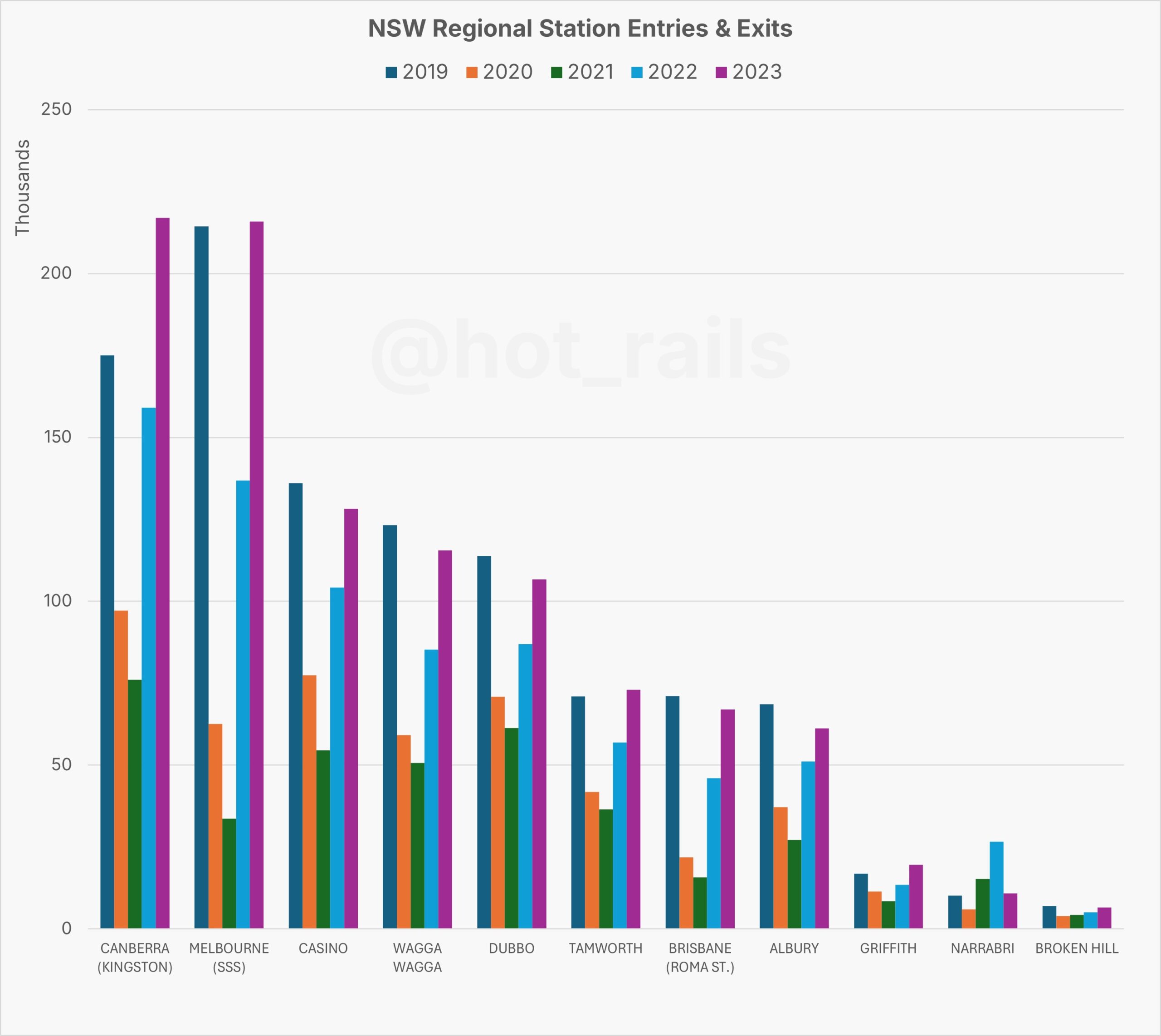
Tabulating the data for selected major and terminal stations gives us some interesting insights.
- The internal NSW routes show a typical 51% drop from 2019 to the COVID low in 2021; drops range from as low as 38% (Broken Hill), to as high as 60% (Casino, Wagga Wagga and Albury were all around this percentage, likely reflecting the larger share of their total patronage that was destined for Brisbane or Melbourne, rather than Sydney)
- Cross-border destinations unsurprisingly show much bigger lockdown drops. The worst is Melbourne, whose 2021 patronage was 84% down on 2019, with Brisbane showing a similar 78% drop.
- Narrabri bucked the trend completely, showing a 50% increase on 2019 levels, further increasing to well over double in 2022, before dropping back down to the long-term average in 2023. It’s not clear what caused this – perhaps the air service was suspended during COVID before being reintroduced in 2023??
The differential in the lockdown patronage drop can be used to estimate the normal percentage of passengers at each station whose destination was Sydney (or elsewhere in NSW), versus interstate destinations. COVID caused a general reduction in travel, even within NSW which mainly avoided lockdowns. The 100% internal NSW destinations saw an average 51% patronage drop in 2021 compared to 2019. The 100% interstate destinations (to Melbourne and Brisbane) saw an 84% and 78% drop, respectively. By generalising these trends (ie, assuming a baseline drop due to COVID, and a further drop due to interstate border closures) we can calculate the interstate proportion of travel at each station thus:
\[ \text{Interstate %} = \left( \frac{\text{Drop}_{\text{station}} – \text{Drop}_{\text{base}}}{\text{ExtraDrop}_{\text{max}}} \right) \times 100 \]
… where:
- Dropstation = the % drop in patronage from 2019 to 2021 for that station;
- Dropbase = the average patronage drop for all stations without interstate connections;
- ExtraDropmax = the maximum extra drop, over and above DropBase, for all stations.
In practice, we apply a different ExtraDropmax according to whether the station’s interstate patronage is primarily influenced by Victoria or Queensland.
Estimated Interstate Patronage by Station
- Victorian influence:
- Sydney: 46% (I put Sydney here because there are two daily XPTs to Melbourne, versus just the one to Brisbane, and the Melbourne XPT serves several additional destinations within Victoria, compared to just Brisbane)
- Yass Junction: 52% (presumably Melbourne-Canberra transfers?)
- Harden: 23%
- Cootamundra: 28%
- Junee: 26%
- Wagga Wagga: 26%
- The Rock: 68%
- Henty: 30%
- Culcairn: 16%
- Albury: 30%
- Queensland influence:
- Canberra: 23% (I put Canberra here because it was more likely to be Sydney airport transfers, to destinations other than Victoria)
- Maitland: 5%
- Taree: 24%
- Kempsey: 10%
- Nambucca Heads: 19%
- Urunga: 37%
- Sawtell: 4%
- Coffs Harbour: 30%
- Grafton: 3%
- Casino: 35%
- Kyogle: 87%
These results should be treated cautiously; there could well be other factors at play not considered in this simplified model. However the general trend of 20-30% interstate travel for major border-region stations sounds plausible.