


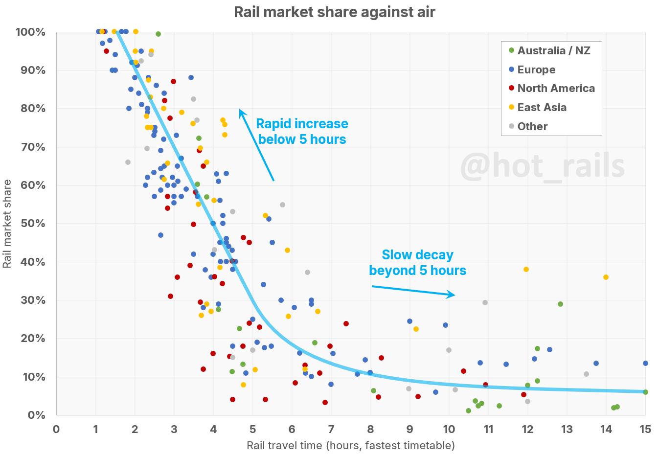
It has long been recognised – at least as far back as 1988, during planning for the Channel Tunnel – that the market share achieved by a rail service against an airline serving the same route can be modelled simply as a function of the duration of the train journey. What’s less often appreciated is the universality of this model. It is applicable in every scenario – fast trains or slow, long-distance or short, big city or small, even rich world or poor. It’s practically a law of physics – and therefore an important and useful tool in the discussion of improved passenger rail services.
Previous studies of this type have mostly been limited either in the absolute number, or the geographic distribution of their samples, or have focused only on high-speed services. While not taking anything away from their validity, they have therefore have failed to highlight the universal applicability of the relationship. This is what we hope to address with our review, the largest and most comprehensive study of its type ever published. Our sample currently includes 219 datapoints covering 133 unique city-pairs across six continents. The criteria for inclusion is simple – if a rail service has (or had) a competitive air route, and we could find either patronage or market share data for the train service, it was included. We limited the sample to trains taking 15 hours or less – about the limit for a practical one-day (or night) train.
The Chart
The data is presented below as an interactive html chart. Although it is viewable on mobile devices, it renders best on desktop displays (if you must use a mobile device, best to use landscape orientation).
- Hovering the cursor over a data point will display a tooltip showing the city pair, year, travel time and market share.
- Clicking on a region in the legend will show only the data from that region; clicking again will reset the chart.
- The chart will dynamically resize if you change the width of your browser window.
Number of datapoints by region:
- Australia / NZ: 22
- Europe: 101
- North America: 41
- East Asia: 37
- Other: 18 (mostly Africa, South America and the Middle East)
Discussion
There are two aspects of the chart that are particularly striking. First is the dramatic takeoff in market share as travel time drops below about 5-6 hours should put to bed any argument that fast-rail services must be sub-3hrs to be “competitive”. This is more like the point of market dominance – no mature rail service taking 3 hours or better has a modeshare of under 50%. The trend market share at 3 hours is 70%; at 2 hours it is 90%. Curiously, of all the trains taking between 2½ and 3 hours, New York to Washington DC scores both the lowest market share (31% in 1989) and the highest (87% in 2018)
But more impressive (and perhaps unexpected) is the durability of rail’s market niche for much longer services. Even at 10 hours and beyond, rail is far from an insignificant player, with most routes in the 5-20% range (Australia’s chronically underinvested interstate routes are the only major cluster of significantly sub-5% shares). There appear to be three main factors affecting this:
- Relative affordability: less wealthy markets (China, Africa), heavily subsidised rail services (Argentina), or older data where air travel was relatively more expensive (1970s Australia, 1980s Spain), generally show a higher rail market share.
- Rail service quality: especially evident at longer travel times, a rail service with good frequency, amenity, or convenience can attract significantly above-trend market share (e.g. the resurgence of European night trains). Conversely, an infrequent service (such as Adelaide-Melbourne’s twice-weekly Overland) or one with inconvenient timetabling (like Chicago-Cleveland on the Lake Shore Limited, arriving after 1am) will generally perform below-trend.
- Geographic considerations: Difficult or inconvenient competitive modes can give the train an advantage (e.g. the Norwegian routes, particularly Trondheim-Bodø, face lesser competition from driving due to the mountainous, fijord-obstructed terrain).
It’s also notable how similar the trend remains across different regions. In particular, the popular notion that North Americans are less inclined to take the train than Europeans is demonstrated to have no basis in fact – indeed, many of the major American city-pairs are significantly above-trend. The large number of routes within striking distance of the 5-6hr takeoff point augurs well for the Americans soon reclaiming their mantle as the world’s pre-eminent rail nation.
Selected city-pairs through time
The chart’s trend is obvious and compelling, but the data is admittedly very noisy; this is unsurprising given the multiple additional variables in play on each unique route. It is therefore more instructive to look at how a particular city-pair has changed over time, especially if the rail service has undergone a significant improvement in travel time. We have several instances of data for the same city-pair but from multiple years. Some of the more interesting are:
- Paris-Lyon – Shows the introduction of TGV and subsequent speed improvements on LGV Sud-Est.
- Frankfurt-Köln – Having already introduced ICE in the ’90s, this data shows services pre- and post-Schnellfahrstrecke Köln–Rhein.
- Madrid-Barcelona – showing pre- and post-AVE services, plus the proliferation of low-cost competition in the late 2010s; this is probably the best case study of HSR rollout on a long-distance route in an advanced Western economy.
- Stockholm-Gothenburg – pre- and post-X2000, showing the modernisation of a network without (yet) the progression to full HSR.
- New York-Boston – Replacing the old Metroliners with the modern Acela Express, along with improved frequency, results in a modest travel time improvement but a dramatic increase in market share, showing the critical importance of these variables.
- Beijing-Shanghai – Notable in the significantly above-trend performance of the pre-HSR route, a result of China’s HSR rollout coinciding with spectacularly rapid economic development.
- Adelaide-Melbourne – Showing the effect of increasing competition from air without any improvement in the rail service, followed by a reduction of service frequency.
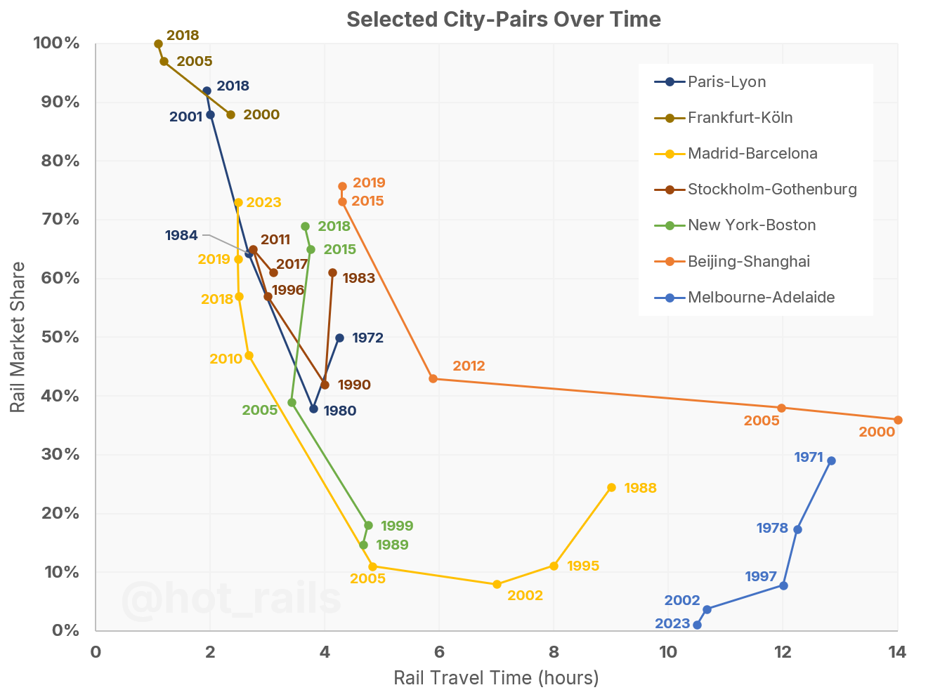
This is probably my favourite visualisation to have come out of the whole project. We see very clearly that once services on a particular route reach a threshold level – somewhere between 3 and 4 hours – significant market share can be gained with service improvements and price competition. We also see several routes experience a significant loss of market share to air despite modest improvements in travel time – this reflects the rapidly increasing competitiveness of the air market during the 1970s and ’80s.
Data Sources – Detail
The remainder of this article discusses the data sources that have been used to construct the chart. Many directly report a percentage figure for market share, sometimes including additional modes like car or bus (in these cases we adjust the percentage to be just the air+rail market). In other cases we have taken a rail patronage figure and directly compared with the competitive air route. Where deemed necessary to modify the rail patronage figure for the number of passengers between specific destinations, we describe the method used to make this estimate in each case (the method varies depending upon what information is available).
Air patronage figures are generally fairly easy to obtain, either through national or regional official statistics, Official Aviation Guide (OAG) “top 100” lists, or where all else fails, making reasonable extrapolations from publicly available aircraft schedules.
AECOM 2013
The best pre-existing example of an air-rat market share chart that I have found appears in the 2013 Australian High Speed Rail Phase 2 Report by AECOM (Appendix 1A – Previous HSR demand studies in Australia and overseas). This was itself an agglomeration of three previous studies:
- “VHST Study” refers to East Coast Very High Speed Train Scoping Study, by Arup (2001),
- “EC Study” refers to Air and Rail Competition and Complementarity, by Steer Group for the European Commission (2006)
- “Nash Paper” refers to HSR Overseas Experience Report, by Chris Nash (2011), prepared for AECOM’s earlier Phase 1 report.
It is a good base to work from, already showing the clear trend from 2-5 hours travel time, but it suffers from a lack of data for longer-duration city pairs. Much of the data is also 20 years or more out of date, though this is still useful for historical context and comparison with the newer, often faster versions of these routes.
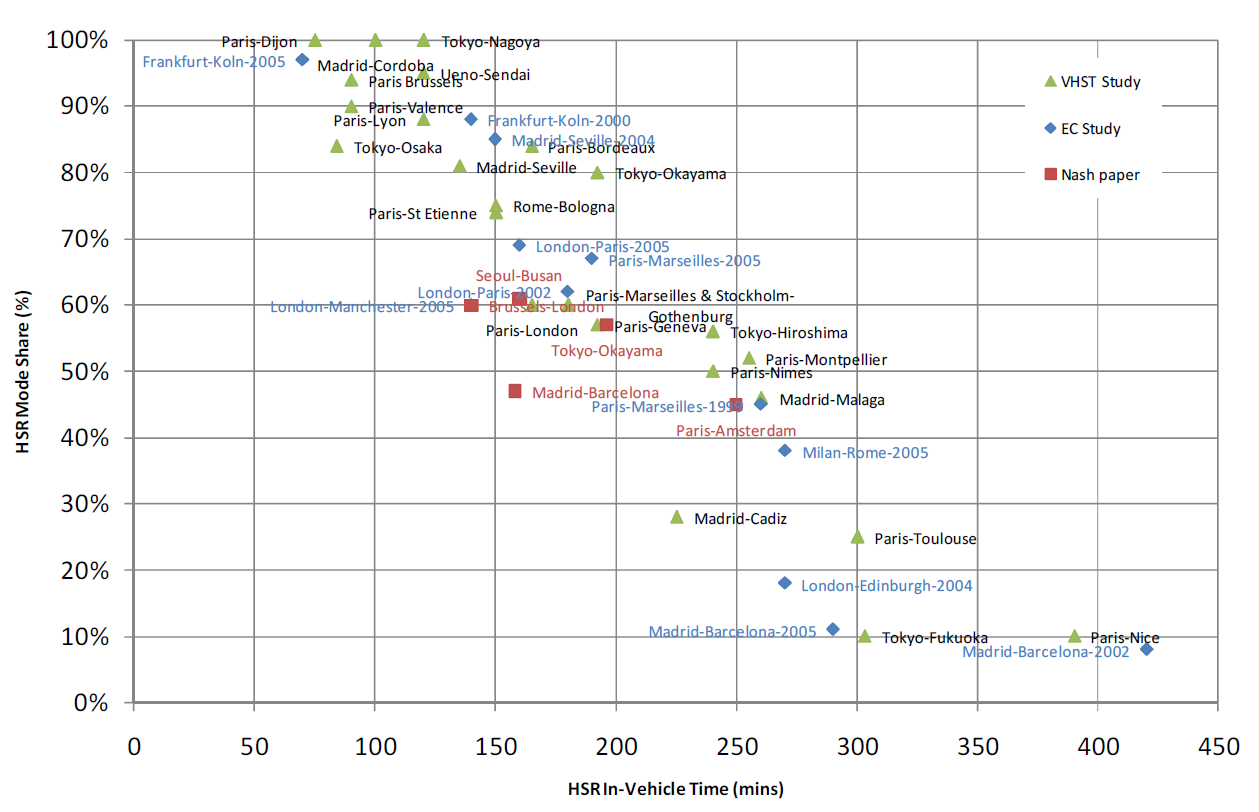
AECOM also adopts a logistic trendline (“S-curve”) first proposed by Peter Jorritsma in 2009 and now widely popularised.
Lundberg 2011
Anna Lundberg’s 2011 study for Norwegian Railways, Competition and interaction between rail and air – Part 1 – International Comparisons, publishes a similar graph of contemporary market shares. While it has many of the same routes looked at by AECOM, it also includes several we don’t find elsewhere – particularly German routes. Lundberg proposes an exponential decay function, which correctly predicts the complete withdrawal of air services where the rail time is below 1.5 hours.

LEK Consulting 2019
A 2019 report published in LEK Consulting’s Executive Insights (Vol.XXI, Issue 9), “New Routes to Profitability in High-Speed Rail,” provides more recent data for many of the same routes in the AECOM and Lundberg charts; the data is based off proprietary in-house research and international travel surveys. They propose a linear “best fit line” when measuring the “time saving versus air” rather than overall rail journey time – an assumption which our data indicates is accurate for travel times below 5 hours, but inapplicable at longer travel times.
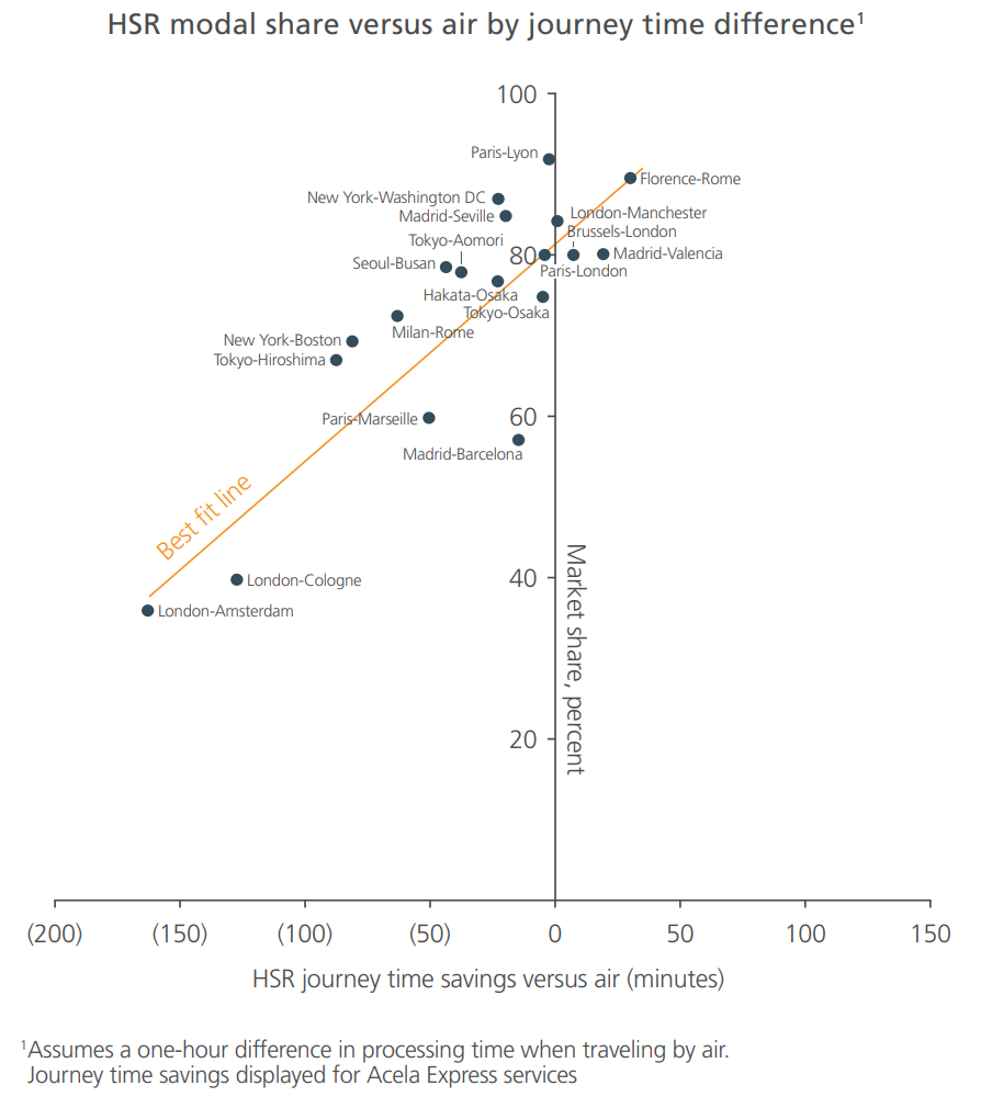
This not only gives us a few new routes, but the update to existing routes is very interesting, particularly Madrid-Barcelona, which emerges as a spectacular candidate for “most-improved” route, reaching 57% from its low of 8% just a decade and a half earlier. This route has continued to make headlines, increasing its modeshare to 63% in 2019 and 73% in 2023.
North America
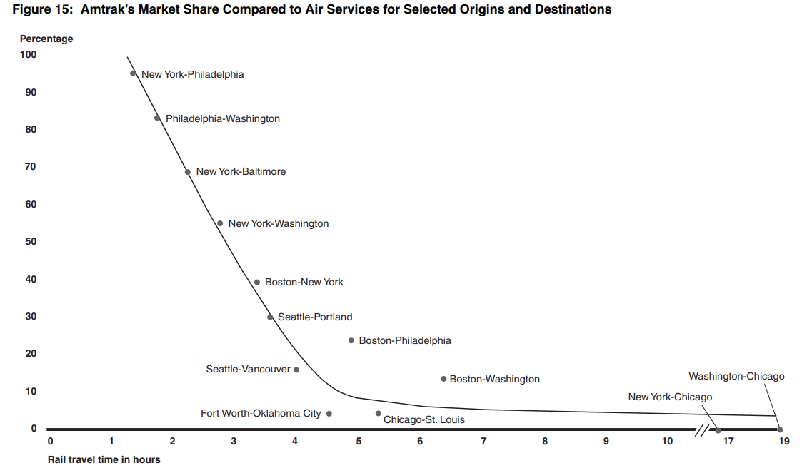
A November 2006 report from the Government Accountability Office (“Intercity Passenger Rail – National Policy and Strategies Needed to Maximize Public Benefits from Federal Expenditures“) included a chart of modal share versus travel time, based on McKinsey & Co. research and Amtrak reports; the data refers to financial year 2005. This chart is notable in that is apparently the first to propose the two-part trendline that we have also adopted (steep for travel times between 1.5 and 5 hours, transitioning to a much flatter gradient thereafter) rather than a linear, logistic or exponential trendline as most other reports have done.
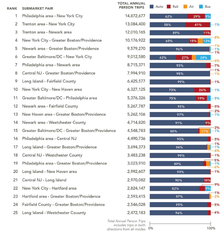
Acela Corridor
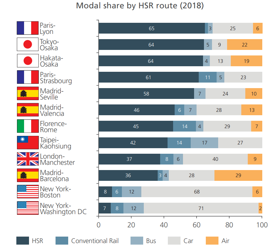
Also for North America, the Northeast Corridor Intercity Travel Study (September 2015) gives a detailed breakdown of modeshare (car, rail, air and bus) between city-pairs along the Acela corridor between Washington DC, New York and Boston. We can easily isolate the air and rail components of the relevant city-pairs with the data in the following summary table:
Amtrak data
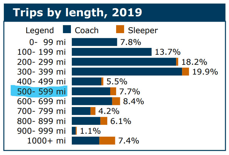
More modern Amtrak data is available at the Rail Passengers Association website, who keep a detailed set of statistics on each Amtrak service, While they do not give specific city-pair patronage (annoyingly, since it’s obvious they have this data), they do break down the annual total patronage by journey distance, in hundred-mile increments. Particularly on the longer routes, this is often sufficient information to isolate the ridership between specific city pairs. We’ve mostly chosen to use the latest pre-covid data, from 2019.
Comparing this to the 2005 McKinsey data gives some interesting results – notably, the Chicago-St. Louis and Fort Worth-Oklahoma City routes have both gone from fairly poor performers (~4%), to capturing an impressive share of the market (46% and 36% respectively). This is a result of improved services being introduced on both corridors (the Lincoln Service, introduced between Chicago and St. Louis in 2006, increased the frequency from once to five times daily, also cutting 34 minutes from the trip). On the other hand, Boston-Washington DC has gone from a decent 10%+ share, to around 3% – apparently a result of slower trip times on the increasingly congested Acela corridor, as well as rapidly increasing air traffic.
Generally, it is interesting to note the good modeshare of American city-pairs, for both long and short-haul routes, compared to European and Asian counterparts. This counters the conventional narrative that American rail underperforms international benchmarks; the number of major routes at or slightly longer than the 5-hour takeoff point suggests that a relatively modest American fast rail program could drive significant modal shift.
Brightline
Private fast rail operator Brightline began its first long-distance operations between Miami and Orlando in September 2023; it has been an instant success, with Brightline reporting 79,686 passengers in the month of October 2023 (956,000 projected annually), rising rapidly to 115,683 by December (1.39 million annualised). That’s already an incredible 50% market share after 3 months of operation; Brightline is aiming to increase this substantially, projecting over 4mppa by 2025 and currently operating 16 trains per day in each direction; this is certainly one to watch (as well as Brightline West between LA and Las Vegas, currently slated to begin operations in 2027).
Canada
The St Lawrence River corridor between Toronto, Montréal and Québec is one of the most densely populated regions of North America, and frequently touted as a potential fast-rail route. In fact, Canada’s ViaRail already runs several very respectable services along this corridor: Toronto to Montréal (6 trains per day), Toronto to Ottawa (9 trains per day), and Québec to Ottawa via Montréal (6 trains per day). ViaRail in 2019 reported 2.7 million passengers on the Montréal-Ottawa-Toronto corridor, and 936,000 for Quebec-Montréal-Ottawa. Considering the relative train frequencies, population on intermediate stations, and competitive air traffic, the train would have the following market shares:
- Toronto to Montréal – 23%
- Toronto to Ottawa – 34%
- Montréal to Québec – 58%
Australia
Australia has precious few intercity rail services, and fewer still that compete directly with a regularly scheduled air service. Australia’s Bureau of Transport and Regional Economics (BITRE) keeps impressively detailed statistics on its domestic air traffic, going back as far as the 1940s for some time series. For the rail patronage, we look at each city-pair individually:
- Adelaide to Melbourne – See our deep dive on the historical patronage of The Overland from August 2023; as well as the current twice-weekly service, we’ve included historical datapoints from 2002 (the first year it ran with almost the current timetable), 1997 (the last year it ran to a full seven-day frequency) and 1971 (for comparison with other outlier city-pairs which have high rail market share despite long journey times).
- Sydney to Canberra, Melbourne and Brisbane – We’ve used Opendata – Trainlink regional train and coach patronage for 2023, and Train Statistics 2014 for 2013. The data is for total passengers carried on the line; we assume that 80% of passengers on the Canberra line are through-passengers, and 60% for Melbourne and Brisbane. Pre-XPT numbers are from the Bicentennial High-Speed Railway Project 1981 (itself citing the 1977-78 National Travel Survey)
- Sydney to Newcastle – OpenData gives us daily turnstile counts for every station on the Opal network; Newcastle Interchange has 4,090 passengers per day, coming to 1.49mppa.
- Melbourne to Albury – V/Line patronage data shows 44,207 passengers for Albury Station in FY17 (courtesy of Philip Mallis); it would be reasonable to assume the vast majority of these are through-passengers from Melbourne.
- Perth to Kalgoorlie – The Kalgoorlie Prospector recorded 85,952 passengers in 2018-19. A pretty high percentage of this figure would be through-passengers; the shorter AvonLink and MerredinLink services collectively carried 16,710 passengers over the same period (offering about the same weekly frequency, too), suggesting that about the same number of passengers from the Prospector would be alighting at those destinations. Intermediate passengers for the small towns between Merredin and Kalgoorlie would be few (perhaps amounting to a further 1,000 passenger per year), which would mean 77% of the Prospector‘s patronage was between the terminal stations.
- Queensland – The Tilt Train runs some pretty well patronised (and heavily subsidised) services up Queensland’s east coast; 2019 patronage was 46,000 on the Bundaberg Tilt Train, 168,000 on the Rockhampton Tilt Train, 114,000 on the Spirit of Queensland (all the way to Cairns) and a further 15,000 on the Spirit of the Outback (to Longreach via Rockhampton). These are impressive numbers, but the situation is complicated by the high proportion of intermediate passengers in each case (the route encompasses several of Australia’s top-50 air routes). It’s probably most reliable to look at patronage at each station instead; Bundaberg is Queensland’s busiest regional train station with 91,000 journeys (2017), while Rockhampton had 55,000 in 2022 (proportionally suggesting around 73,000 pre-covid). Considering the populations and relative train frequencies, 50% of the station patronage would be a reasonable estimate of through-passengers, ie, 45,500 for Bundaberg and 36,500 for Rockhampton.
- New Zealand has three long-distance passenger trains remaining:
- Northern Explorer (Auckland to Wellington) – Runs 3-times weekly with a pre-covid ridership of around 65,000. AKL-WLG is also the busiest air-route in New Zealand at 2.7mmpa (2016).
- TranzAlpine (Christchurch to Greymouth) – Prior to the 2011 Christchurch earthquakes, ridership was 77,000.
- Coastal Pacific (Christchurch to Picton) – While the train has a decent ridership of 43,000, the competitive air route to nearby Blenheim is seriously niche, with a Pilatus PC-12 (passenger capacity of 9) flying just 17 return flights per week – not a reasonably competitive route, so we’ll exclude it.
Scandinavia
I was very keen to find useful data for Scandinavian city pairs, due to the region’s geographic similarity to Australia (in the sense that the population is highly urbanised in a few large cities, with large areas of very low density and only a few much smaller cities in between), as well as having comparable demographics and economic complexity (especially in the case of Norway, which is a heavily resource-dependent economy). The region has a good proportion of medium-speed, long-distance routes with travel times in the 5- to 8-hour range, making it a good comparator for near-term upgrades to the Australian rail market.
Sweden
Sweden (like Australia) has been studying the possibility of improving their (unlike Australia) already very well maintained and patronised conventional network, so there is a reasonably good availability of data for routes in this region. The 2021 Travel Demand Review by Sweden’s Trafikverket gives us modeshare figures for Stockholm to Gothenburg, Malmö and Copenhagen (the figures appear to be based on 2019 travel data, but projected out to 2030 as a “without HSR” scenario). This study also gives us a 2018 figure for Berlin-Munich.
We find excellent modeshare data for the major routes in Sweden – annually from 1980-2009! – in Part 2 of the Lundberg study referenced earlier – Competition and interaction between rail and air – Part 2 – Time series analysis in Sweden. Unlike Part 1, this has not been translated into English, but it’s well worth the trouble to go through it with Google Translate – it explains the Swedish experience with the introduction of fast tilting trains, the general market dynamics and the transition points for air-to-rail modal switch better than perhaps any other study I have seen (it also identifies that rail lost market share to air between 1980-1992, even with no change in travel time, but that there was no such loss from 1992-2009 – suggesting that the air market was mature by the early 1990s.).
There is more detail on the Stockholm-Gothenburg route in a 1998 article in the Journal of Rail and Rapid Transit, The experience of the SJ X2000 tilting train and its effect on the market.
Recent Stockholm to Umeå figures can be inferred from a 2014 travel survey by Umea Municipality, which reported that regional trains carry 325,000 passengers annually from Umeå’s two stations; a reasonable estimate might be that a third of these would be through-passengers to Stockholm (there are 9 direct trains per day, typically taking a bit over 6 hours). Prior to the completion of the Bothnia Line in 2010, there was just a single night train in each direction, taking almost 10 hours.
Stockholm to Oslo figures are given in a summary of a recent Oslo-Stockholm high-speed rail feasibility Study.
Norway
Statistics Norway reports the annual performance of its four long-distance passenger trains, giving data for both passenger numbers and passenger-kilometres – which means we can easily calculate the average passenger’s trip distance. We can therefore, with a bit of mathing around, make a pretty good estimate of the proportion of through-passengers (ie, passengers between the terminal stations).
The key assumption we have to make is the average distance of just the intermediate trips. This number is bounded; it can be no more than the average distance of all trips (which would imply there were zero through-trips), and it must be more than zero – quite a lot more, at least the distance of the first few stops, but probably less than half the total line length. If we assume the average distance of intermediate trips is 75% the average distance of all trips, the above conditions are fulfilled. Allowing a reasonable loading for intermediate routes that still compete with the same air-route (say, an extra 25%), we find the following proportions of through-passengers:
| Route | Total pax | Pax-km (million) | Average trip (km) | Through-pax (%) |
| Oslo-Trondheim | 788,000 | 281.2 | 357 | 39% |
| Oslo-Bergen | 905,000 | 281.0 | 310 | 37% |
| Oslo-Stavanger | 680,000 | 177.9 | 261 | 25% |
| Trondheim-Bodø | 372,000 | 126.4 | 340 | 22% |
Finland
YLE News (Finland) claims a patronage of 1.1mppa between Helsinki and the northern town of Oulu; While this is surprisingly high for a long-distance route to a relatively small town (the Oulu region has 263,000 people), it appears reasonable given the line’s high frequency (15 direct trains per day in each direction).
East Asia
Japan
Although we’ve already got quite good data for Japan, we can find air-rail market share for additional city pairs (or more recent data for the 2001 pairs) directly reported in JR’s fact sheets and annual reports. These are amazingly informative documents, with a wealth of interesting information in addition to current and historical market shares. Links here:
Taiwan
We find a pre-HSR figure for Taipei-Kaohshiung (2006) in a Transportation Journal article, The Predicament of Domestic Airline Service after the Introduction of Taiwan High-Speed Rail.
China
The world’s largest high-speed rail network is conspicuous by its absence in previous work of this type. The dearth of published data on high-speed rail market share in China is surprising, especially considering the wealth of data that the Chinese state almost certainly possesses; we were able to find only one study that explicitly presented actual market data for multiple city pairs – a 2015 study by Huazhong University, Forecasting passenger travel demand for air and high-speed rail integration service: A case study of Beijing-Guangzhou corridor, China presented data for four city-pairs on the Beijing-Guangzhou trunk line. The study considered three competing modes: high-speed rail only (“H”), air only (“A”), and a combined mode (“AH”) where high-speed rail was used to access a hub airport, with air used for the main leg. For our purposes we combine modes A and AH, as air is the main travel mode in these cases.
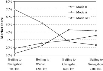
This data is interesting in that it is one of the world’s very few ultra-long-distance HSR routes; Beijing-Guangzhou’s straight-line distance of 1,900km is practically transcontinental – think Madrid to Berlin, Adelaide to Perth, or Chicago to Miami. This is a distance at which airlines typically dominate overwhelmingly, yet in this case we see rail mode share exceeding 20%. This market dynamic is likely a result of the heavily subsidised rail service outcompeting expensive air travel in a relatively low-income country (somewhat comparable to what we see in the Adelaide-Melbourne data during the 1970s).
The 1,318km Beijing-Shanghai High Speed Railway is an important route to include, as one of the top-ten busiest flight routes in the world. We find pre-HSR data in a 2010 Journal of Air Transport study (graph below), and 2012 data in a 2013 International Transport Forum study (which also corroborates the 2005 data). For 2015 and 2019 we have figures for traffic density, which means we can calculate passenger-kilometres and therefore use the method we employed for the Norwegian routes. Total patronage and traffic density were widely reported as 130 million and 48 million passenger-kilometres per kilometre respectively in 2015. The average trip distance is therefore 487km, implying just 13% of total patronage was between the terminal stations (16.6 million passengers). A later 2019 Paulson Institute case study put total patronage at 215 million and traffic density at 75 million, representing a slightly higher market share in the rapidly maturing market.
This data shows Chinese HSR modeshare to be significantly higher than most other regions; this is likely due to the combination of relatively low income level (meaning flights are more unaffordable) and the heavy subsidy and high service quality of the HSR service.
Night Trains
The revival of the European sleeper train has been one of the most surprising recent developments the rail industry, having gone from “The end of the line?” to “We are full, we are full, we are full” in six rather eventful years. The commercial success of these trains means that patronage figures are in many cases treated as closely-guarded trade secrets, though we find a couple of figures directly reported – 200,000 for Berlin to Zurich, and 120,000 for Berlin to Stockholm in its first, immediately post-covid year. Even back in 2019, Austrian Railways CEO Andreas Matthä said “on busy routes we are talking about 100,000 passengers per year as a typical number“.
The popularity of the new night trains is such that they are consistently booked out, in some cases 6 months or more ahead of time. This means that if we know the capacity of the train, we can estimate an annual patronage by multiplying by the number of trains per year (we’ll conservatively add an 80% capacity factor). We find a few datapoints here, mostly on the extremely popular NightJet routes out of Vienna, while admitting that this is the most severe handwaving we’ve done to calculate a market share figure.
Other Regions
- Arabia – Spanish operator Renfe reports that the Haramain railway between Mecca and Medina carried 6.97 million passengers in 2023. The competitive air route via the nearby Jeddah airport (also on the Haramain line) now carries only 5 flights per day in each direction, giving the railway a market share of about 94%. Riyadh-Dammam figures are in a 2018 University of Southampton paper.
- Argentina – The National Commission for Transport Regulation keeps detailed statistics for intercity and long-distance passenger trains; we include the routes from Buenos Aires to Rosario, Cordoba and the coastal resort of Mar del Plata. We have to make an assumption for the percentage of through-trips; a third would be a reasonable estimate.
- Brazil – Mining giant Vale reintroduced daily passenger rail to the Vitoria-Minas Railway in 2022; Railway Gazette estimates the annual ridership at 400,000, though some sources claim up to a million. The competitive air route between Vitoria and Belo Horizonte is one of the busiest routes in Brazil.
- Egypt – According to ICS Travel Group, the Cairo-Luxor-Aswan night train carries about 400,000 passengers per year. Given the relative populations on that line, it would be reasonable to assume perhaps a third to a half of those would be between Cairo and Luxor; taking 40% as a mid-range estimate, that would put the train’s market share at about 29% – an outlier to the upside in our model, but to be expected given the country’s relatively low income level.
- Indonesia – A pre-feasibility study for the Jakarta-Surabaya high-speed railway included a 2017 origin-destination patronage matrix for the existing “Executive Train”. The first stage of the fast railway, to Bandung, opened in 2023 and reduced travel time to Surabaya from 10hrs to 8 hours 5 minutes, but the service is so new that updated patronage data is not yet available.
- Kenya – China’s “Belt and Road” initiative completed the Madaraka Express railway between Mombasa and Nairobi in 2017; Xinhua reported that 2.39 million passengers used it in 2022. Given the low populations of the intermediate towns, a reasonable estimate would be that some 90% of this figure was between the terminal stations, giving rail a market share of 53%.
- Morocco – North Africa Post reports that the flagship Al Boraq train between Tangier and Casablanca carried 2.4 million passengers in 2021; given the relative populations, we would expect about 40% of this figure to be between the terminal stations, which gives the train a 92% market share.
- Russia – Mark Smith, “The Man in Seat 61” has 2010 figures for Moscow-St Petersburg modeshare, for both the “Sapsan” high-speed service, and the slower overnight and regular trains; While Smith does not cite a source, 2019 data from Russian Railways gives ridership of 5.69mppa for Sapsan, which is broadly in line with Smith’s figure. The same source from Russian Railways reports 557,200 passengers between St Petersburg and Helsinki on the fast “Allegro” train in 2019, giving the train an 82% market share.
- South Africa – A 2013 report into the railway sector notes both the weekly ridership and the market share of the 6-times weekly Johannesburg-Durban train.
- Turkey – A 2020 article by the director of Turkish Railways, High Speed Rail in Turkey: Vision 2023, provided air-rail market share data for the Ankara-Konya, Ankara-Istanbul and Konya-Istanbul routes.
- Uzbekistan – A 2012 article in Uzbekistan Daily reports that the twice-daily Afrosiyob train between Tashkent and Samarkand carried 200,000 passengers in its first year. Notably, Uzbekistan later ordered a further two Talgo-250 high-speed trainsets, as well as extra carriages to expand their existing two sets – this figure would therefore be substantially higher today, however I have been unable to find more contemporary data.
Note: This page may be periodically updated as new and/or better information becomes available.
I have been following the success of Brightline in Florida USA and the comments from business commuters using the service for the first time and responding that they intend to use the rail service more often is encouraging.
As for the Overland this intercity passenger train service under current management needs to be converted to a tourist train to replace the Great Southern.
The Overland is also under a cloud as the Hornblower Group have Journey Beyond Rail up for sale.
I have had a meeting with JBR CEO and Operations Manager and the outcome was that JBR would continue their plans for The Overland on the same course with minimum improvement. Their overall plan was that they wanted to travel between the two cities with a full passenger load without additional passengers from rural communities.
For The Overland to improve requires;
the journey to travel via Ballarat
2 way daily or 6 day return service limited stop
new VLINE or Private passenger rail service between Bordertown to all stations to Ballarat ( no pick up) then express to Melbourne and return.