In September 2014, the Bureau of Transport and Regional Economics released a fascinating report, Long-term trends in urban public transport, the core of which was a detailed reconstruction of the public transport patronage for Australia’s capital cities. It’s now been over a decade since BITRE updated this dataset, so I’ve added data for 2015-2024 – a very interesting period encompassing some significant investments into public transport infrastructure, as well as the covid lockdowns and recovery.
I found the most interesting visualisation of this data to be a stacked area chart of patronage by mode, to which I’ve added annotations of key events that caused major moves. The charts thus tell a surprisingly detailed story about the history and urban “personality” of each city. 1945 was the 20th century peak in public-transport patronage in all states. The mass adoption of the private car sees public transport patronage decrease steeply, even in the face of rapidly growing population. Tram networks are replaced, to one degree or another, by buses; heavy rail patronage remains stagnant, or falls gradually. The consistent downward trend reaches a nadir in around 1980, after which each city responds in remarkably different fashion.
Let’s look at each in turn…
Sydney
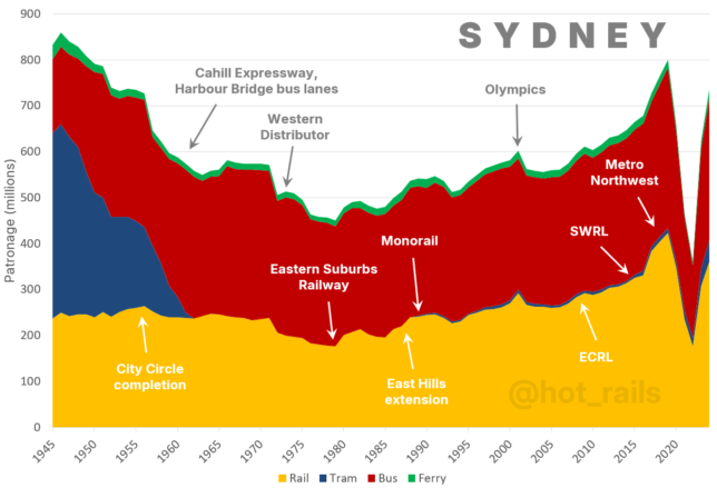
Of all the Australian capitals, Sydney has maintained the most consistent investment into its railway network. Even the City Circle is relatively recent, the loop having been finally completed in 1956. However, this was followed by an almost thirty-year stagnation, during which time the city’s freeway network was greatly expanded. Through the mid-century, public transport patronage stayed still while the city’s population nearly doubled – a story repeated across the major capitals. Sydney’s however stayed at a relatively high – the only Australian city to do so.
With the opening of the Eastern Suburbs railway in 1979, Sydney’s rail network began a four-decade and ongoing revival. The introduction of Metro Northwest in 2019 turbocharged this trend, and the current expansions of the City and Southwest lines should mean the ramp-up continues for many years yet.
Melbourne
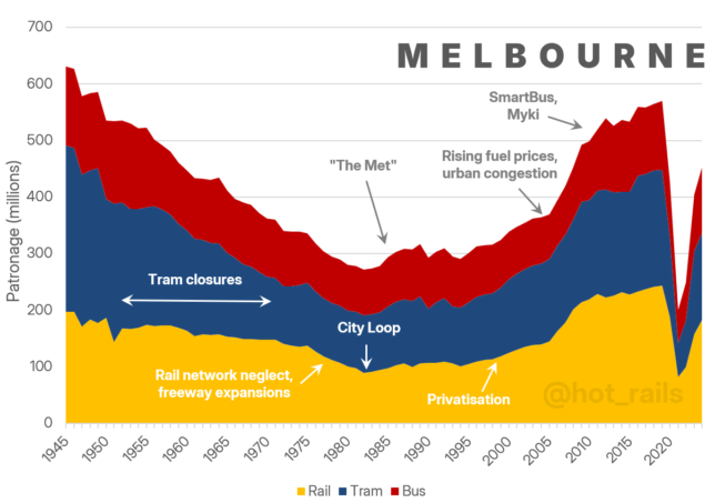
Melbourne is famously the only Australian capital to have retained most of its tram network, a fact of which the city is justifiably proud. Partly a result of public opposition, and partly due to the inherent advantages of the tram network in Melbourne’s inner-city grid, the decline of it’s network was arrested in around 1970. However this wasn’t entirely a good thing – the decline of trams is not matched by a corresponding increase in bus patronage, as it generally was in other cities. Melbourne’s mid-century drop in overall public transport patronage was therefore far deeper than Sydney and most other cities, and service levels outside the tram belt lag far behind other major cities. Keeping the trams led Melbourne to neglect the remainder of their network, for which they are now paying the price.
Another striking feature of this chart is how consistent it is. The transport task has remained reasonably well balanced between heavy rail, trams and buses, with no major inflections, save for the sudden across-the-board surge in PT patronage starting around 2005. There’s no one obvious reason behind this, but it was around the time Melbourne’s population really began to surge in response to high net migration levels. Infrastructure has been playing catch-up since then – both road and rail – with a number of large projects nearing completion as of 2024. This will go some way toward improving the public transport catchment, but Melbourne will need to get serious about buses at some point if it wants a broadly accessible network.
Brisbane
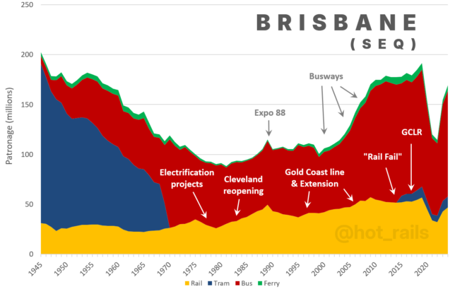
Australia’s third city, now over 4 million people including its satellite regions of Gold Coast and Sunshine Coast, is making great efforts to break out of its car dependency. Its investment in dedicated busways has more than doubled patronage between 2000 and 2010, and the recently opened “Metro” (autonomous electric bendy-buses) is likely to rapidly increase this further.
The rail system has had similar investment but only modest patronage gains to date, a result of inner-city capacity constraints limiting the service frequencies achievable on their numerous new lines. Several investments now nearing completion or underway should significantly improve this situation: Cross-River Rail will bypass the congested inner city stations, while the introduction of ETCS later this decade should reduce minimum headway and thus increase capacity more generally.
Brisbane will need to get this right if they are to successfully meet the immense transport task presented by the 2032 Olympics.
Perth
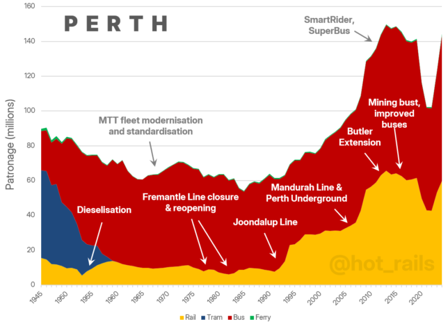
Over the last 30 years, Perth has been the standout success story of Australian public transport, though somewhat unsung. Formerly Australia’s most car-dependent city in the 1980s, a series of well-conceived heavy rail upgrades have completely transformed the way the city travels. The opening of the Joondalup Line, along with development of the CBD and government policies encouraging transit-oriented developments, resulted in an astoundingly rapid quadrupling of rail patronage between 1992 and 1997 (albeit from a very low baseline). In 2005, Perth became the first (and so far, the only) Australian state capital to have surpassed its 1945 peak (though Sydney, Melbourne and Brisbane are all close to doing so).
The Mandurah Line was opened in 2007, resulting in a further doubling of patronage over just a couple of years. Importantly, Perth Underground was completed at the same time – a tunnel bypass of the city with two underground CBD stations, which linked the southbound Mandurah Line with the northbound Joondalup Line. Together, this corridor has become a vital artery providing high-capacity mass transit to the furthest reaches of Perth’s north-south sprawl. Further improvements will come online in the next few years, with the ongoing METRONET program currently building Perth’s first east-west line, an extension to the Armadale line, new stations on existing lines, signalling upgrades, and level crossing removals.
Adelaide
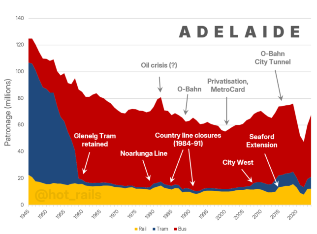
Despite some decent investment into its network in recent years, Adelaide’s rail patronage remains stubbornly low, with the public transport task heavily bus-dependent. While Adelaide is famous for its O-Bahn, with just the one line it doesn’t make much of a dent – both its introduction in 1986, and the extensions in 1988 and 2016, aren’t even noticeable. Overall, this chart is reminiscent of pre-Joondalup Perth.
Despite Adelaide’s rail network having a fairly respectable reach, its utility – and therefore patronage – is hamstrung by low service frequency. The limiting factor is Adelaide Railway Station – a terminal station where trains must change directions, substantially slowing throughput. Adelaide remains the only Australian capital whose main CBD station has such an inefficient configuration. Converting to a through-station with an underground loop, perhaps with a couple of further stations deeper into the CBD, would at least double the capacity of the entire network, effectively future-proofing it forever.
Adelaide is now approximately the same population that Perth was in 2000. It’s way past time to shed the erroneous “small town” mentality and bring the rail network into the 21st century. The hard work is done, with the Gawler and Seaford lines already upgraded. “Adelaide Underground” would very quickly give Adelaide one of the best public transport systems in the country.
Hobart
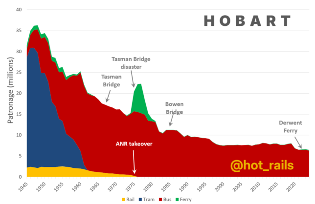
Unique among the Australian capitals, Hobart has entirely failed to arrest the post-war decline in its public transport patronage. After the elimination of its trams and heavy rail, the remaining buses continued to lose patronage steadily in the late 20th century, stabilising at a low plateau after 1999. After the Covid lockdowns, again uniquely among Australian capitals, Hobart’s bus patronage made no recovery at all – in fact, as of 2024 the figures show a slight decline. Metro Tasmania does not appear to have a strategy to counter this decline, accepting the lower plateau in their 2024 annual report as a “new normal”.
The most notable feature of the graph is the enormous peak in ferry patronage after 1975, resulting from the collapse of the Tasman Bridge. For a couple of years, Hobart’s per-capita PT patronage was second only to Sydney! It didn’t last; once the bridge was repaired, ferry transport fell almost to zero, though never completely disappearing. Private ferries remained in operation at a small scale, more recently transporting art lovers to the MONA gallery in Berriedale. It’s fair to wonder whether ferries could once again play a significant role in Hobart’s transport network – there is currently a pilot service in operation between Constitution Dock and Bellerieve, with plans for expansion. However despite Derwent Ferries exceeding expectations, the overall numbers are still tiny, and Hobart remains by far Australia’s most car-dependent city.
Canberra
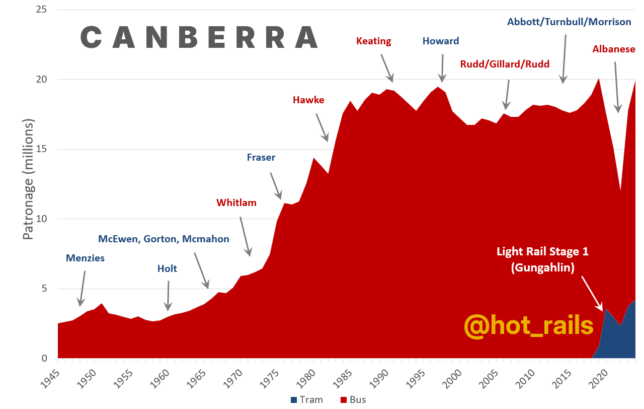
The chart of the national capital looks completely different to the others, showing a dramatic increase in patronage. This isn’t the result of an unusually efficient public transport system, but rather the dramatic increase in population over that time. Canberra is the only Australian capital that was not substantially developed by 1945, then having a population of only 16,000. The patronage chart tracks the growth of the public service, most prominently under Whitlam, Fraser and Hawke in the 1970s and 80s.
Despite the overall growth, per-capita patronage remains moderate. Uptake of light rail has been impressive since its introduction in 2019, rapidly taking around a 20% share of all public transport trips. Due to the covid sip, it’s unclear to what extent this is induced demand, as opposed to direct substitution from discontinued bus services, but the spike in 2019 suggests substantial new ridership. It will be interesting to track Canberra’s evolution as it finally builds the tram network Burley Griffin intended it to have.
Data Notes
Sydney
- From Jan 2015, TfNSW bus patronage figures included outer metro school bus and free boardings, which had not previously been collected (BITRE’s data added a loading to account for this).
Melbourne
- Straight merge from PTV annual reports
Brisbane
- 3.4% loading to heavy rail figures to account for Airtrain patronage (2014 proportions)
- BITRE data excluded Sunshine Coast and Gold Coast patronage, which as at 2014 were approx. 20% of total Translink bus patronage. Rather than try to remove the wider southeast Queensland patronage from the new data, I’ve instead added it a 20% back into the older data, tapering linearly to 0% at 1980 (before which time patronage would have been negligible).
Perth
- Straight merge from Public Transport Authority annual reports
Adelaide
- From 2017, Transport SA annual reports switched their patronage reporting from “Initial boardings” to “Total boardings” (ie, including all transfers as well as just the first journey of a trip); previous BITRE data had added a loading to account for the difference. The loadings for 2015 and 2016 were estimated based on YOY total patronage growth figures for each mode (which were reported separately).
Hobart
- Metro Tasmania reports a statewide first-boarding figure; percentages of Hobart patronage and first-boardings vs all boardings are reported graphically. Data converted to Total Hobart Boardings using Mathew Sharp’s method, here.
- Derwent Ferries patronage taken from corporate press releases and news articles (here and here)
Canberra
- Straight merge from ACT OpenData public transport patronage
- Excludes Queanbeyan


